Learning news design fundamentals at the Inquirer
October 26, 2013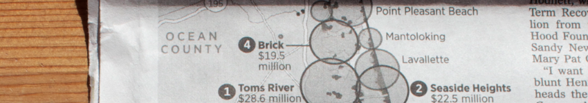
For the past few weeks I’ve been working at the Graphics Desk of The Philadelphia Inquirer. My focus there has been on creating maps and graphics for print.
John Duchneskie, the graphics editor, is incredibly talented and has been a great teacher. Getting to work with and learn from John has filled in a lot of gaps in my design skill set. His guidance and teachings on the fundamentals of news design, typography and information density have been invaluable.
A lot of my assignments have been to create basic maps, but it’s been fun and challenging to create them within the constraints of print–limited space and, largely, no color.
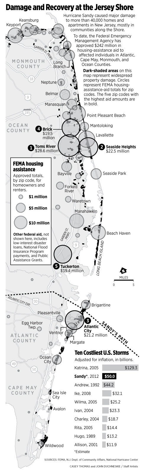
This past week, John and I built a map to accompany coverage of the one year anniversary of Superstorm Sandy. The goal was to create a map that showed damage caused by Sandy, as well as some of the relief money that has been coming in. Here’s what we came up with:
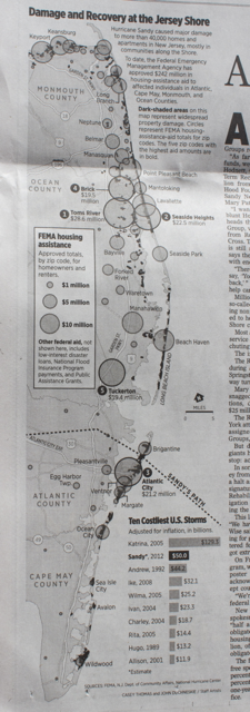
There’s a simple online version (paywall), but our focus was on print. Here’s a high res version from Illustrator. The map was created in ArcMap, but I got to use my NICAR13 R training to create a few exploratory maps, and Tabula to extract data from a NJ report on Sandy aid.
Below are a few other graphics I’ve put together. I’m looking forward to learning some more over the next couple weeks.